Senior Designer @ Booking.com, Partner Services // 2019
Opportunity
There are more than 28 million accommodations registered at Booking.com. These accommodation owners are Booking.com's partners, and we provide them with a set of tools to manage their properties and grow their business. At that time, we didn’t have a consistent illustration style across our partner products. This resulted in inconsistent customer experience, and impacted the overall quality of our design.
Solution
Come up with one illustration style, use it consistently across our partner products and support all product teams with their illustration requests.
My role
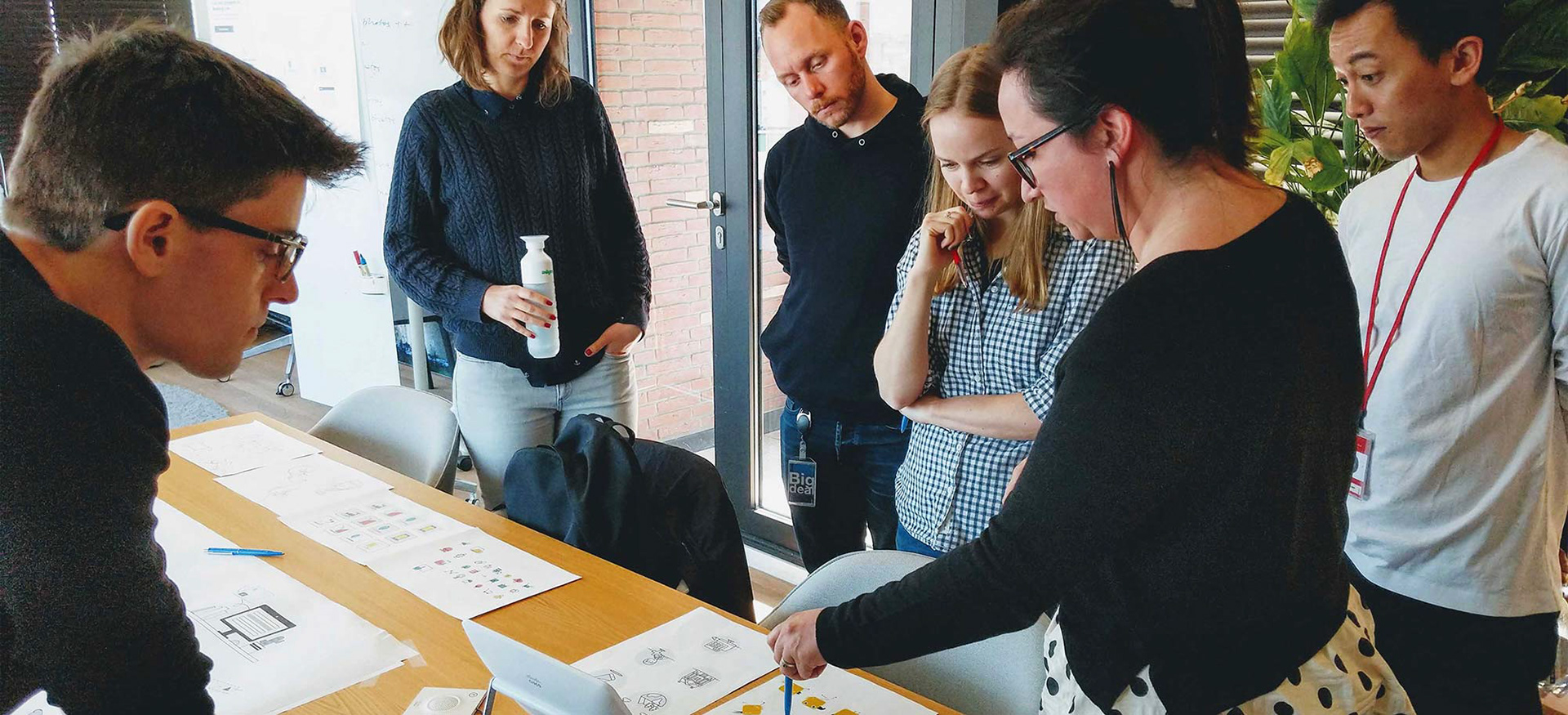
I led the process of defining the illustration style, organised user tests and was the main illustrator on the project.
Outcome
– Defined the illustration style and shaped the illustration guidelines
– Created a set of illustrations for different partner products. Updating product pages to the new illustration style increased customer acquisition up to 6%.
– Created a library with 50+ thumbnail illustrations actively used by 20+ product teams, ensuring faster design work and consistent user experience.

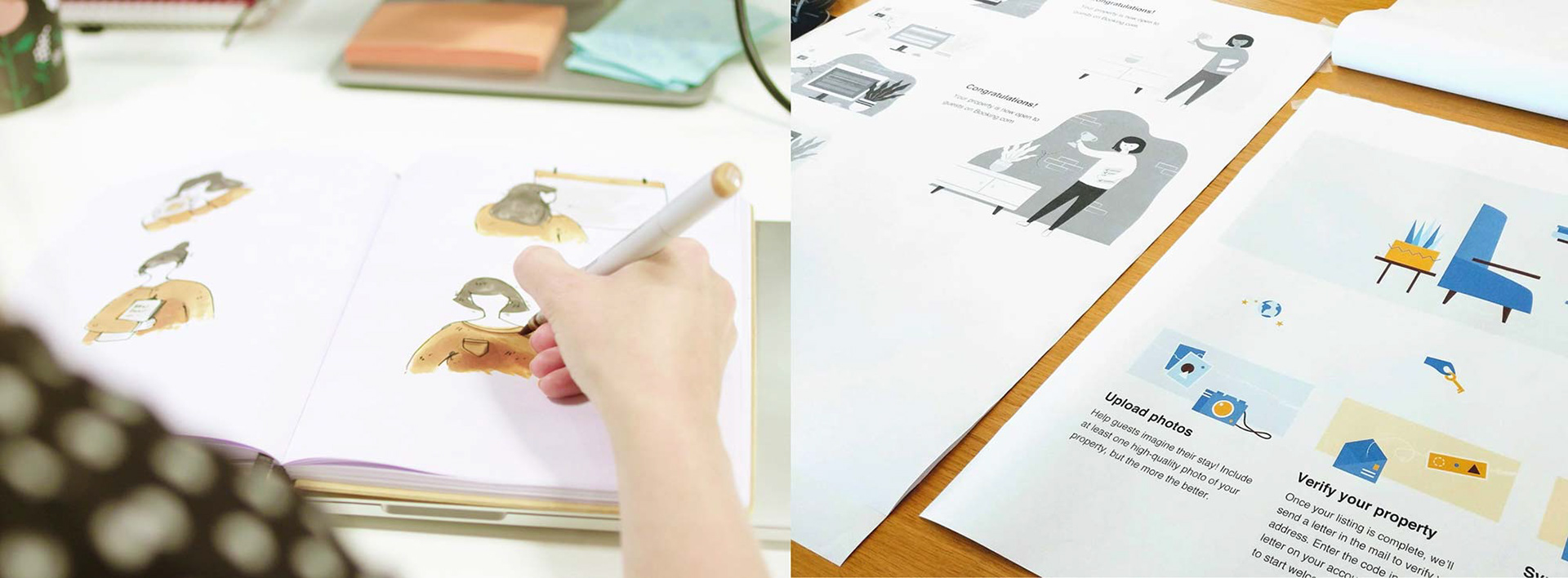
The process
At Booking.com our products can be categorised into two main groups: products for travellers, and products for partners (anyone who provides accommodation and other travel experiences). As we were scoping out our illustration project, we decided to focus on partner products first. Our plan was to create one illustration style, test it and learn from the process before we’d venture into crafting the style for a much bigger audience — a whole world of travellers.
Main steps:
1. Audit the illustration needs
2. Define guiding principles
3. Style exploration
4. Test and style refinement

The result
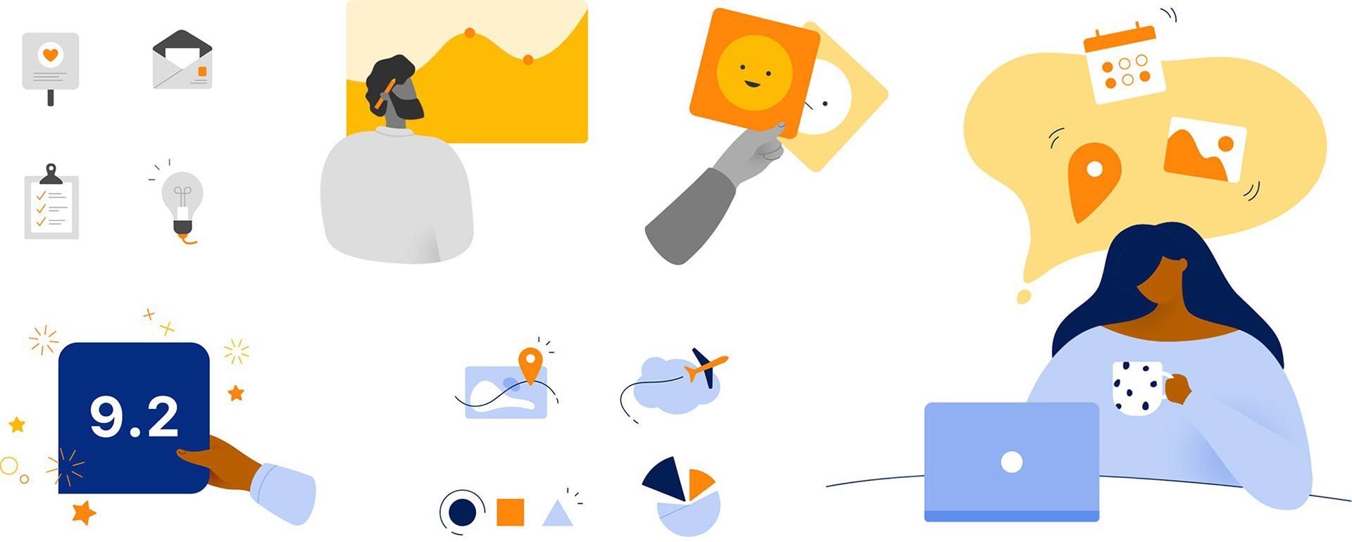
After lots of iterations and a series of user tests, our partner style started to come to life. There’s two color palettes: one for functional in-product illustration (to avoid distracting users), and one for more engaging communication, like marketing campaigns, landing pages and onboarding flows.
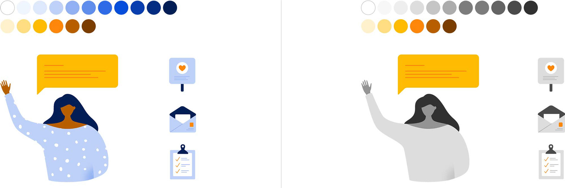
Colour palette variations for engaging and functional communication
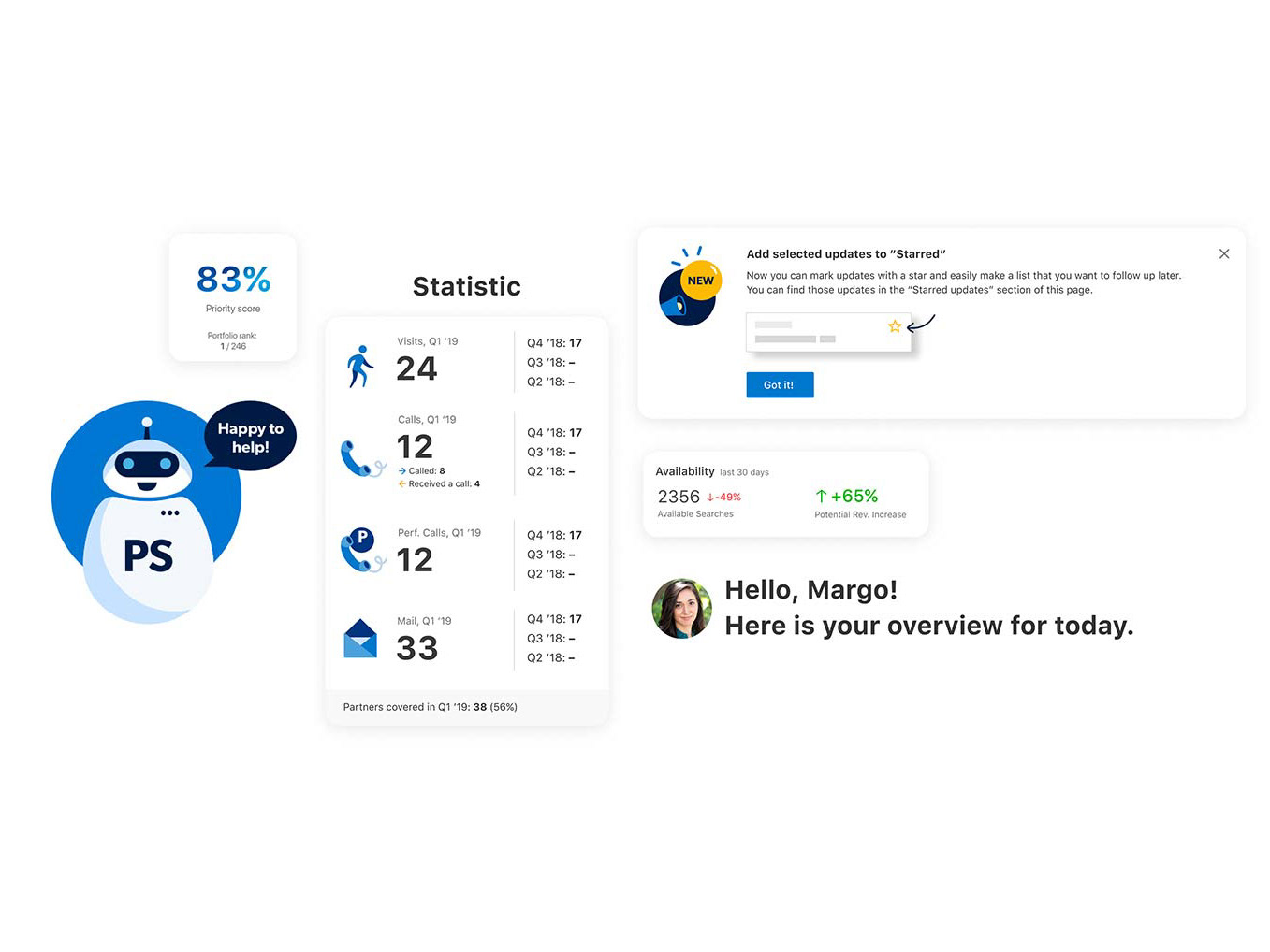
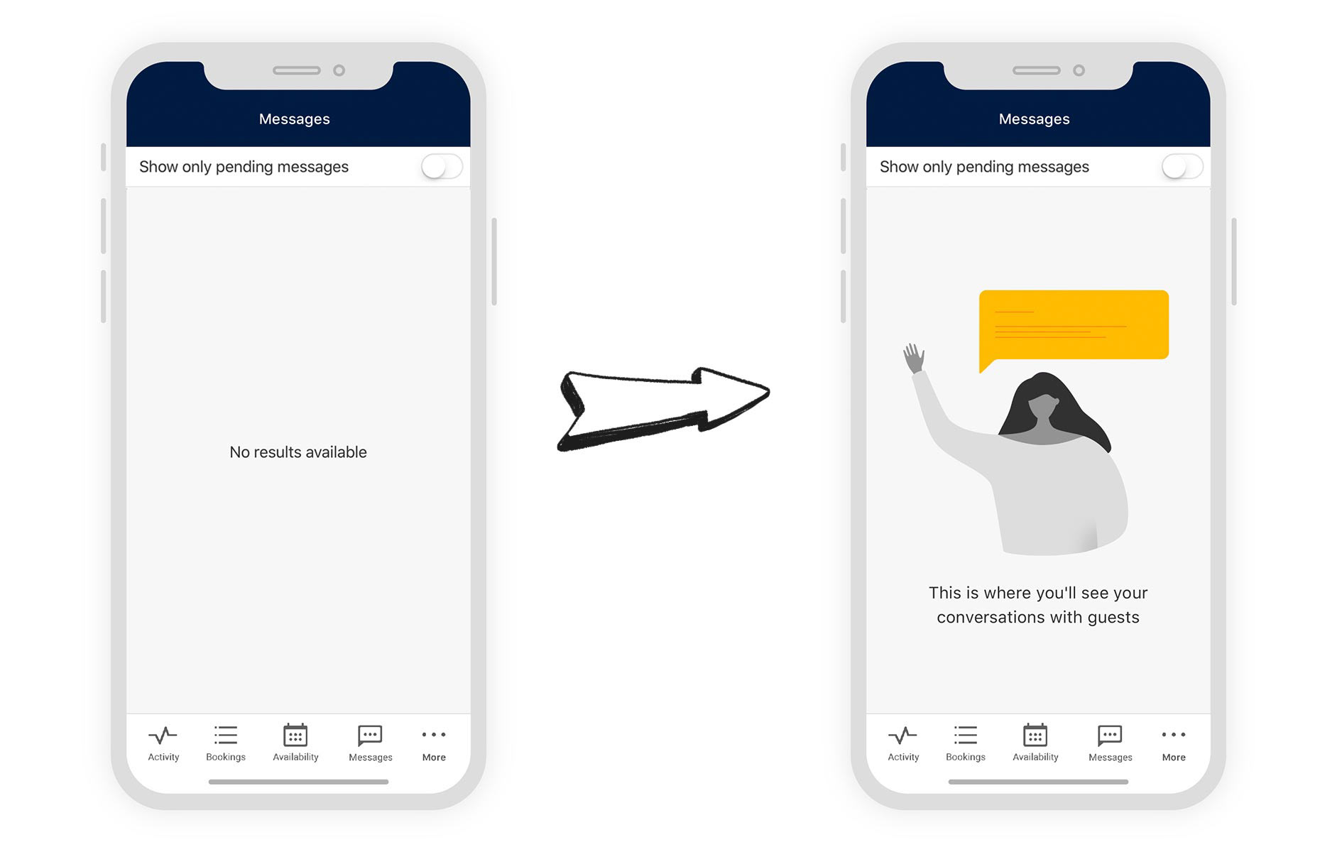
Application in the product: Pulse app
Updating empty states in Pulse (an app that helps partners to manage their property easier and faster). More about this use case
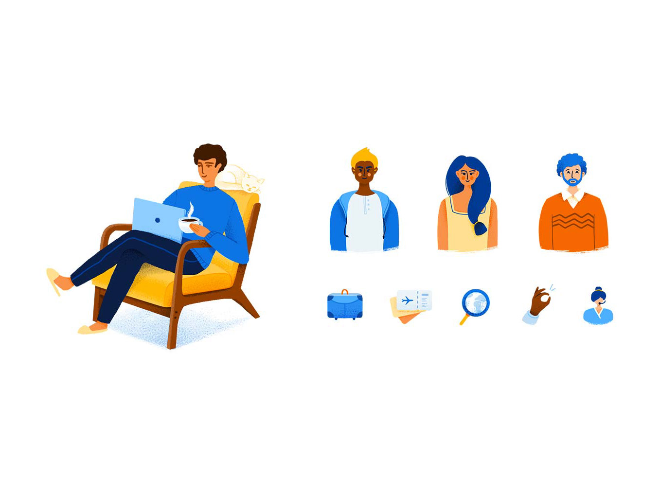
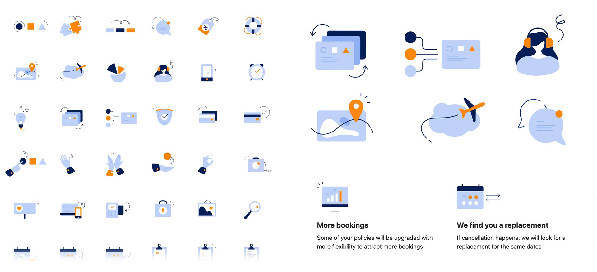
Application in the product: Thumbnails library
I created a set of 50+ thumbnails that product teams could use for our partner products. These illustrations were also available as Figma library and through our internal iconography service for faster development
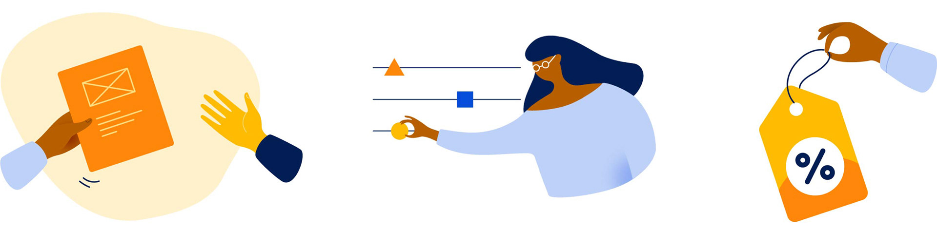
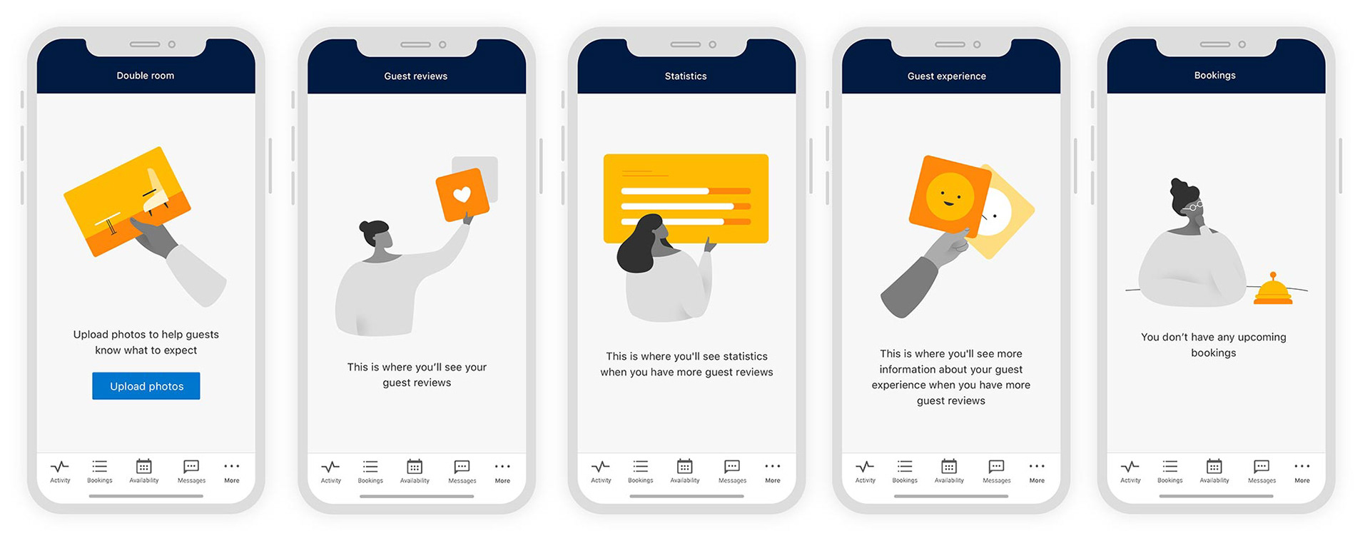
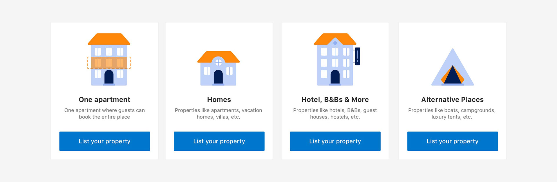
Application in the product: Sign up flow
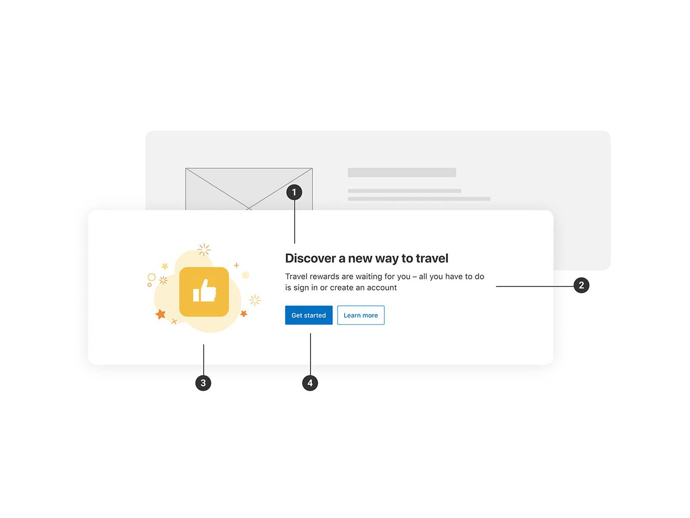
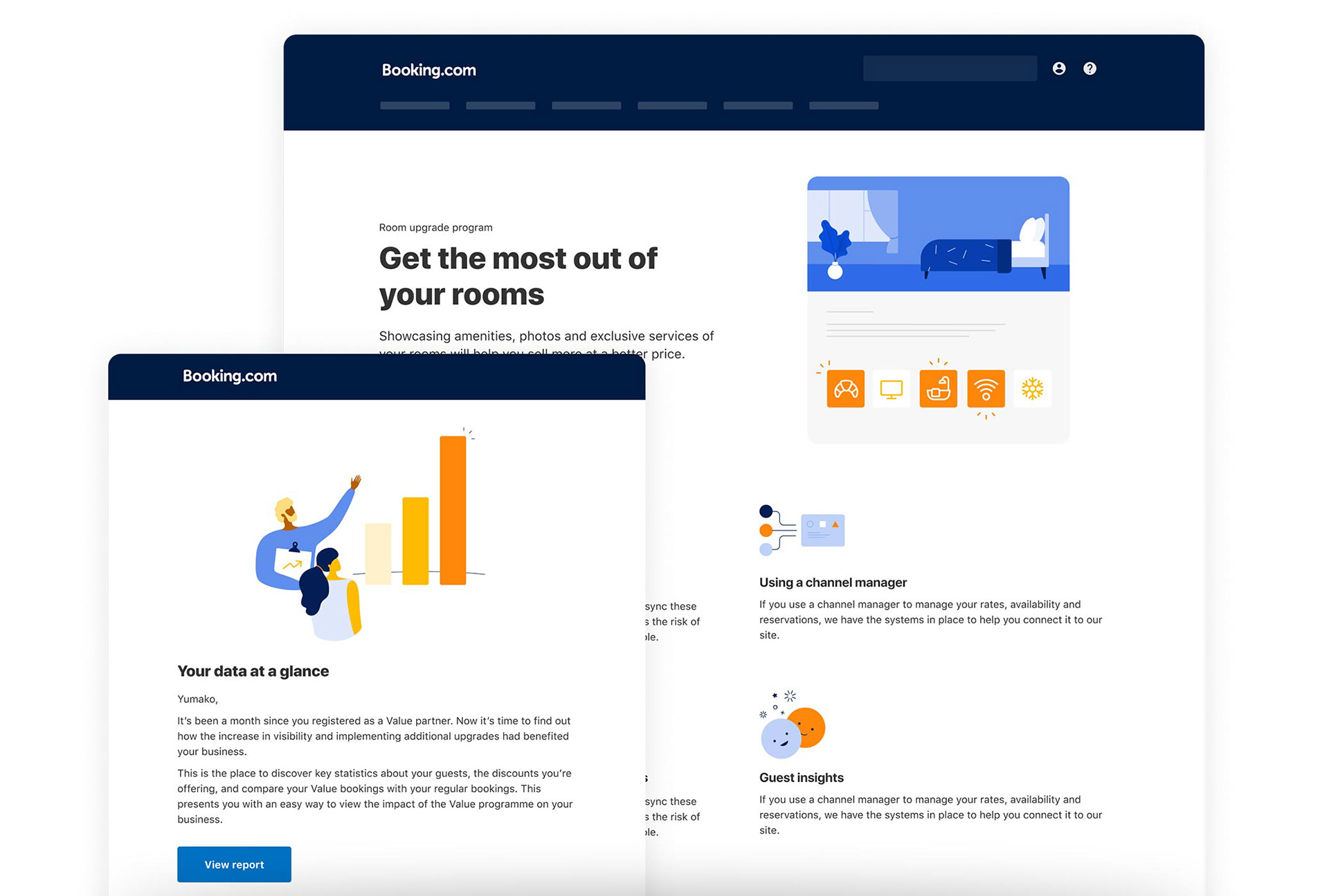
Application in the product: Marketing emails and product pages
The guidelines
After the style was defined, I set up the illustration guidelines. These help explain why and how to apply illustrations in our partner products, and show the style in more detail.
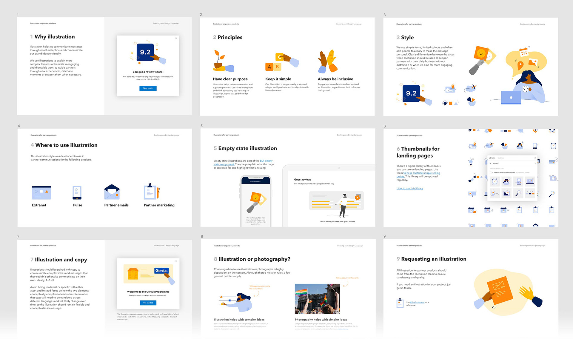
This illustration style is now part of our design system, bringing a consistent look and feel to our partner products.

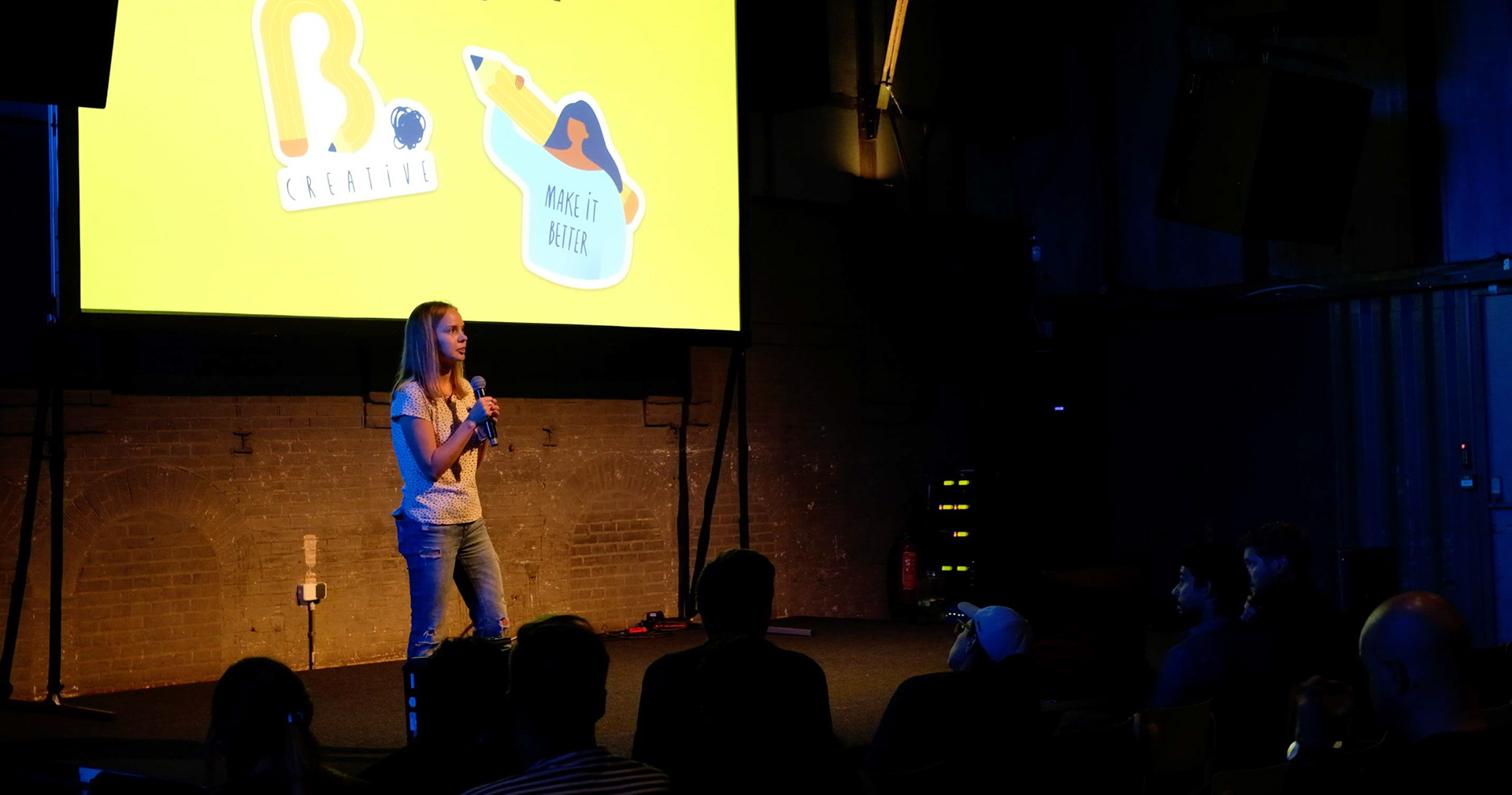
Here's me looking all excited and absolutely hiding my nerves, talking about defining the style and using illustrations in partner products at Booking.com's Craft Conference:

Thank you
Anything is possible when you work with great people. Special thanks to Polina Raevskaya, Gustavo Contreras, Dylan Ralke, Wei Lun Wang, Ana Ordonez, Poli Gilad, Kim dos Santos, Gabriel Agu, Bo Liu, David Lacle, Steven Baguley, Fiorella Rizza and Cătălin Bridinel for their help and support.